Case study · Insurance · 2023
I was told to copy the consumer portal, and I argued that agents aren't browsers
- Lead UI/UX designer
- IA restructuring, dashboard optimization, servicing flows, search logic
- September–December 2023, compressed timelines and fixed backend constraints
Overview
The short version
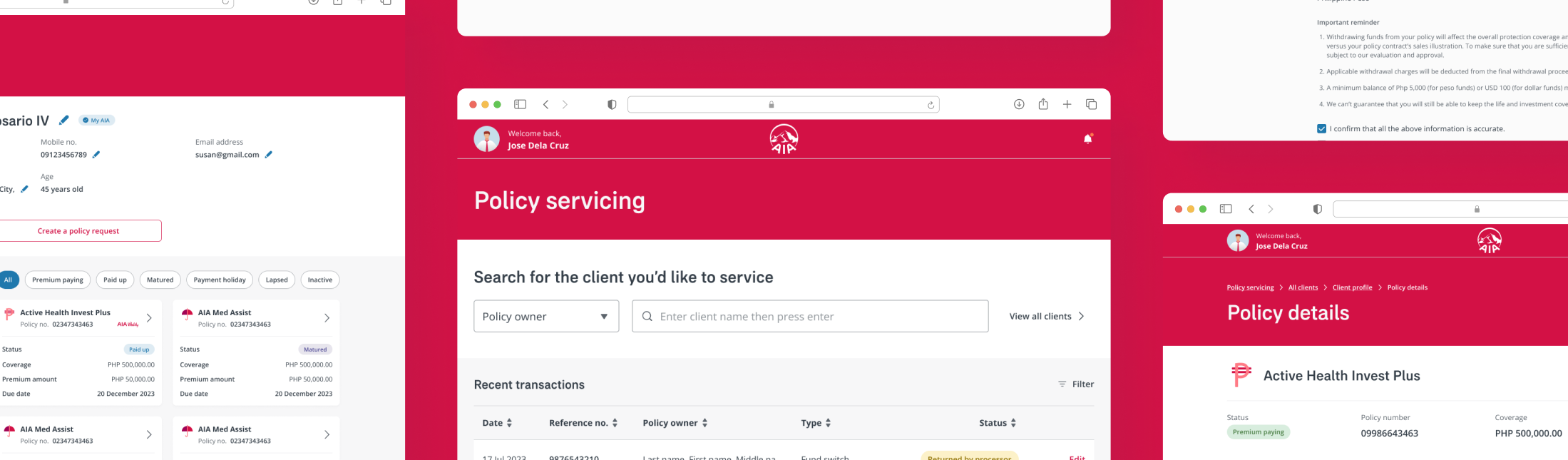
MyAIA Agent Portal was a modernization initiative to replace a decade-old legacy system used daily by insurance agents nationwide.
The initial directive was to mirror the existing consumer portal architecture. But agents are not browsers. They are operational users working live calls, where how fast you find a client and initiate a transaction directly affects the person on the other end of the phone. Consumer navigation patterns are built for exploration. Agent workflows are built for speed.
The challenge
Three constraints working against a clean solution
- Backend architecture could not be significantly altered
- Formal KPIs and documented success metrics were not defined
- The initial direction favored mirroring a consumer-facing structure for a productivity tool
The solution
In the absence of formal success metrics, I defined proxy efficiency indicators to anchor design decisions:
- Minimize navigation depth to reach any primary task
- Surface transaction and service request states at dashboard level
- Reduce dependency on exact policy identifiers for client lookup
- Consolidate fragmented servicing entry points into a single categorized surface
The risk: shipping a modern-looking system that still made agents work harder than necessary, just with a fresher coat of paint.
The work
Strategic focus areas
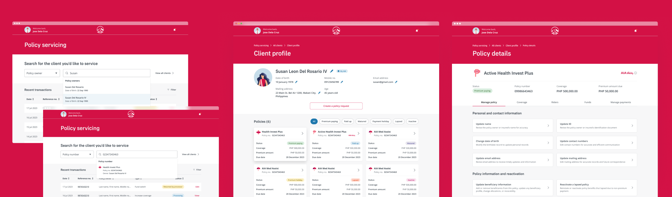
Search as a primary action surface
On a live call, the first thing an agent does is look up a client. The initial structure treated search as a secondary element, tucked away, requiring full policy numbers to return results.
I elevated search into a persistent, always-accessible surface and pushed for partial-match logic so agents could locate clients with partial names or IDs. Less friction at the entry point means faster time-to-task for every interaction.
Dashboard-level transaction visibility
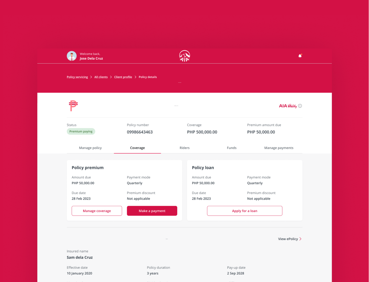
The legacy system required agents to navigate across multiple pages to piece together the status of active service requests and pending fund transactions. A costly pattern when a client is waiting.
I restructured the dashboard to consolidate transaction states and surface time-sensitive action prompts directly. Agents could now assess what needed follow-up at a glance, without drilling into individual policy views.
Consolidating fragmented servicing IA
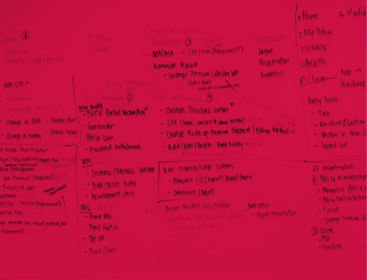
Servicing requests were distributed across layered menu structures with overlapping categories, a legacy of incremental additions over time rather than intentional architecture.
I facilitated an IA workshop with the team to rationalize categories, eliminate redundancy, and map requests to how agents actually think about tasks. The result was a single categorized surface that reduced structural depth and aligned with task-driven patterns common in mature financial servicing tools.
Trade-offs
Navigating engineering constraints
Flattening the navigation introduced real development complexity, and engineering raised valid concerns about scope and timelines.
Rather than defending the design in isolation, I reframed the conversation around the cost of the status quo: every additional navigation layer in a productivity tool has a direct operational tax. Agents pay it dozens of times a day.
We landed on a scoped consolidation, meaningful structural improvement without expanding feature breadth, that engineering could commit to within the existing timeline.
“Malaking help tong update, this takes off a lot of time.”
Testing
Testing & handover
We conducted usability testing with 8 active agents, centering sessions on the two highest-frequency workflows: client lookup and submitting a contact details change request, tasks agents repeat dozens of times daily.
Both tasks were completed without guidance and without the back-and-forth navigation the legacy system required. Agents oriented quickly, and the most telling feedback came unprompted mid-session.
I transitioned out before full production rollout, but the work was in a good place at handover: finalized IA, approved dashboard structure, and core servicing flows actively in development. The design decisions held through testing; building them out was the remaining step.
Looking back
Reflection
This project required making consequential structural decisions without formal KPIs, without prior benchmarks, and without a fully defined product strategy. The proxy efficiency indicators I defined, navigation depth, task initiation speed, dashboard scan time, became the de facto success lens, and they held up in testing.
8 agents isn't a large sample, but the consistency of behavior across sessions was clear: task completion without prompting, faster orientation than the legacy system, and qualitative feedback that pointed in one direction. Had the project continued, the next phase would have focused on quantitative time-on-task benchmarking against the legacy baseline, flow-by-flow validation at scale, and formal compliance alignment for financial transaction flows.
What this project sharpened most was my ability to operate with conviction under ambiguity. Define the right problem when no one else has, build alignment across design and engineering, and make defensible trade-offs when the brief is still being written.