Case study · Design Systems · 2024
I cut our component library by about half by fixing what sat underneath it
- UX designer
- Token architecture, Figma Variables, multi-brand theming, accessibility testing, documentation, cross-BU rollout
Overview
The short version
I started out building components for this design system as a new junior designer at a major multinational insurance company across Asia-Pacific. After working on projects in other business units, I came back with fresh eyes and a clearer view of where the system was struggling.
While learning about Figma Variables, I recognized the gap: the system had design tokens, but no real architecture behind them. Light and dark colors did not share a primitive scale. Dark mode meant duplicating every component. Responsiveness was manual. The library had quietly doubled in size from these workarounds.
I brought a proposal to the design system lead. It became a multi-month initiative with director-level buy-in, a cross-BU presentation, and an eventual industry award. The system now runs across 18 markets.
The problem
Tokens existed. The architecture did not.
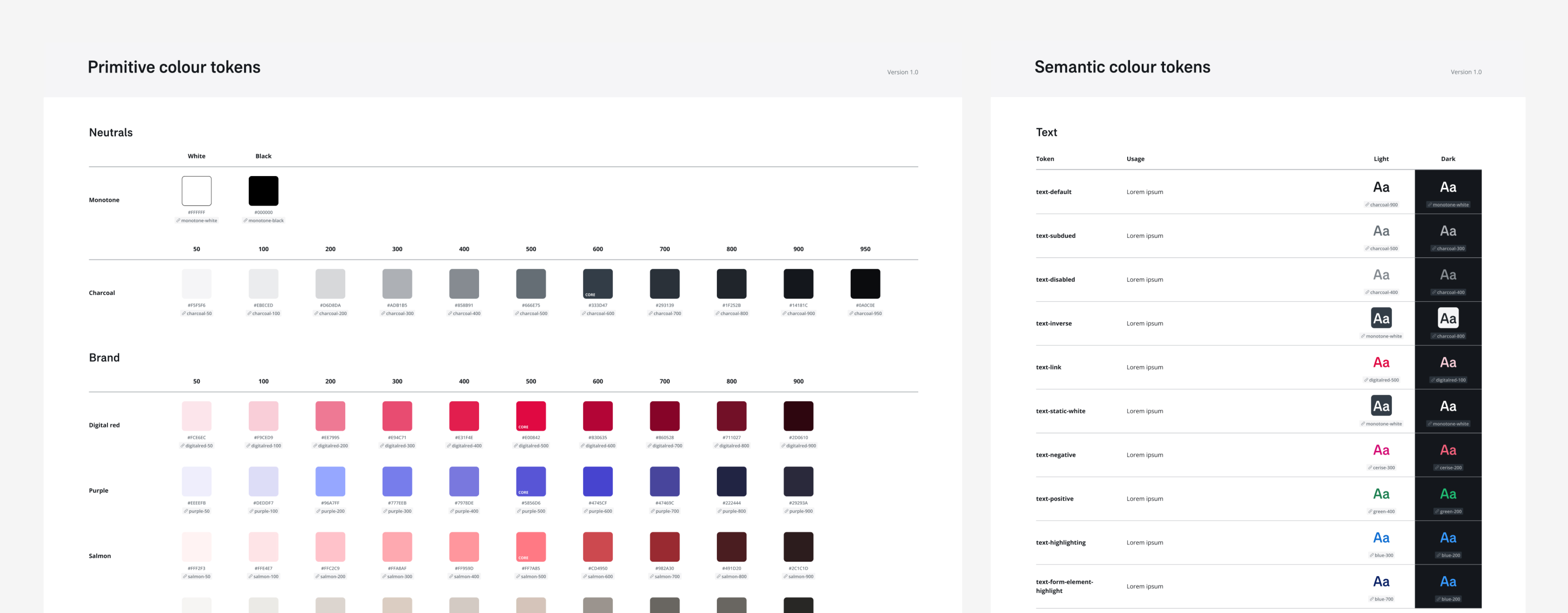
The system had color tokens but no coherent structure behind them. Primitive and semantic layers were not separated, so light and dark values did not share a scale. Everything downstream was fragile.
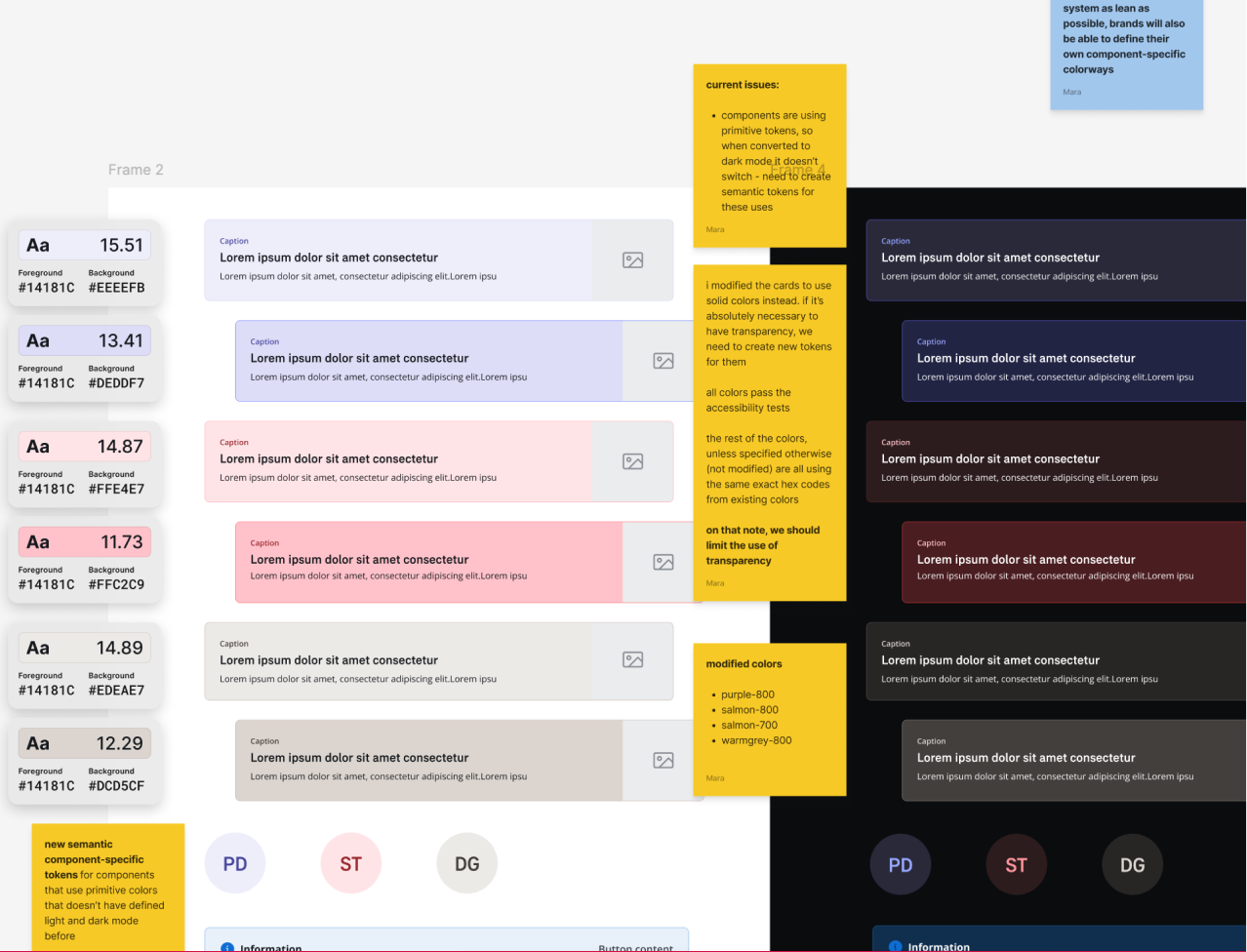
- Dark mode applied by manually recoloring every component
- Light and dark tokens not derived from a shared primitive scale
- Duplicate components for every light/dark variant
- Responsive behavior handled manually, per component
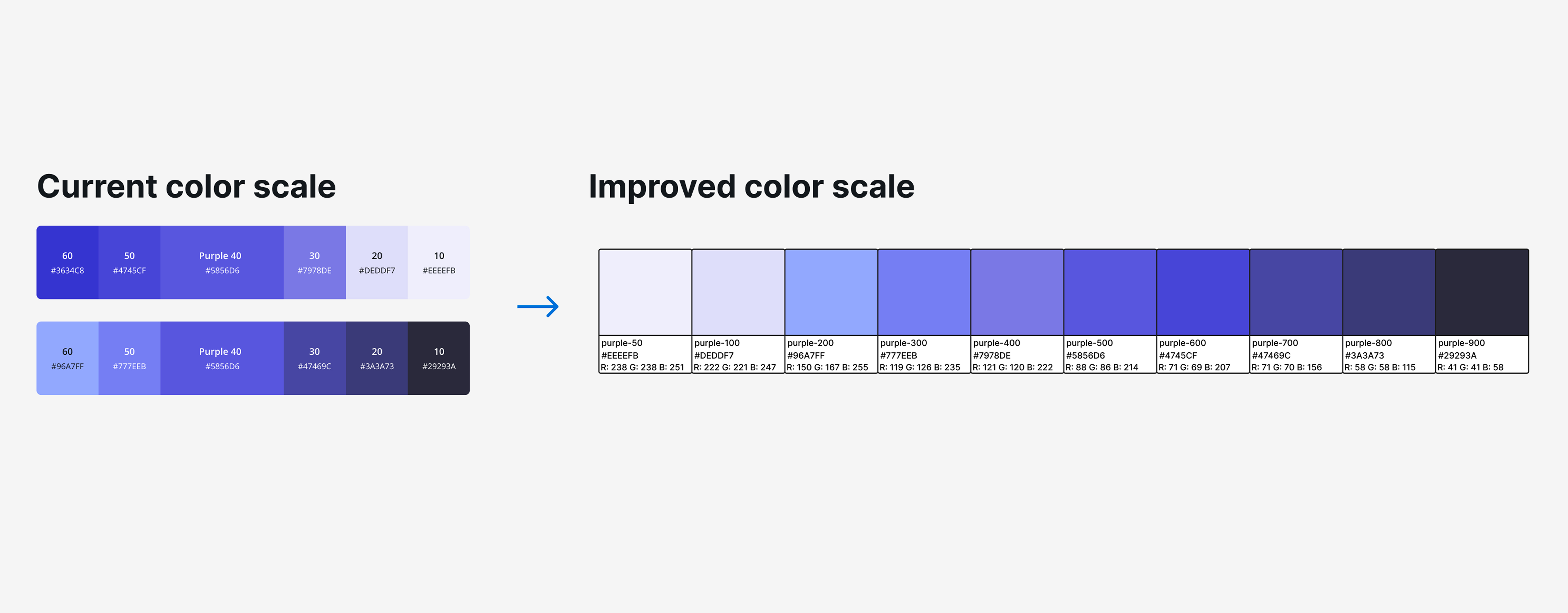
- Color shades inconsistent, some failing accessibility checks
- Token naming misaligned with the codebase
- Bloated, slow library difficult to navigate at scale
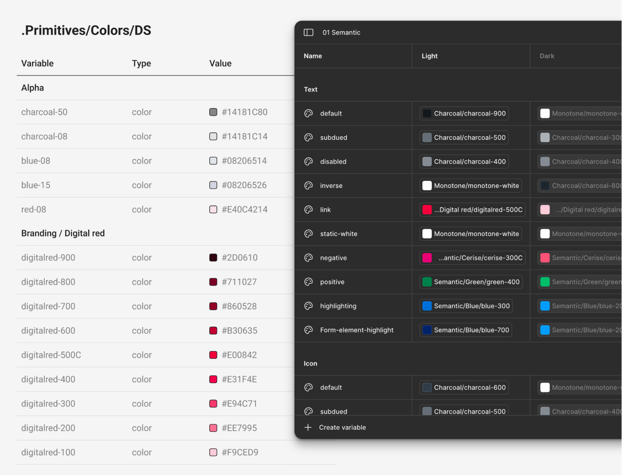
- Dark mode toggled via Figma Variable modes, zero manual work
- All tokens derived from one consistent primitive scale
- Component count cut by roughly half
- Responsive states managed through variable modes
- All tokens passed visual and WCAG accessibility testing
- Token names aligned with dev for clean, unambiguous handoff
- Leaner library now live across 2–3 brands and 18 APAC markets
The work
How we rebuilt it
Token architecture from first principles
I researched the primitive, semantic, and component token hierarchy to ensure the structure could scale across brands without diverging. Primitives hold raw values. Semantics assign intent. Component tokens apply those decisions.
Every token was audited for usage, mapped against intent, and validated against WCAG contrast standards, making accessibility a baseline inherited by any product consuming the system.
Figma Variables with modes
I set up Figma Variables using modes to handle light/dark theming and responsive states. One component could now adapt to any context by switching modes, eliminating duplicate variants and cutting the component count by roughly half.
Adding a new brand became a matter of mapping a new mode, not duplicating the entire component set.
Documentation and rollout
Updated tokens were applied across all components and put through visual regression and WCAG accessibility testing.
The work was presented to multiple BU design teams across the Asia-Pacific organization, with director-level sign-off secured before I transitioned out.
Getting buy-in
Making the case
After learning how Figma Variables worked, I mapped what I was seeing against what was now possible. The pain points were not random; they were symptoms of the same structural gap. I documented the issues, framed the cost to the organization, and brought a proposal to the design system lead.
The pitch focused on scale: manual workarounds serving multiple brands across an entire region were only going to get more expensive.
Before finalizing the token structure, I consulted with the design system developer to confirm the naming conventions could be adopted on the code side without breaking existing implementations. The goal was a structure that worked for both Figma and the codebase, not a design improvement that created an engineering migration burden.
Much of the work turned out to be communication, not craft. Getting alignment across design leads, a developer, and directors meant framing the problem in terms of business cost, not just design quality.
“The point was to reduce friction for everyone, not just designers. A token name should mean the same thing in Figma and in code.”
Impact
Built to scale
The immediate results were measurable: a library half the size, consistent accessible color tokens, and dark mode with zero manual effort. The larger outcome was structural: the system was now built to scale.
After I left, the team continued rollout. The system won an industry award and is now live across 18 Asia-Pacific markets. New brands no longer require duplicating components. Developers and designers share the same token language. Accessibility is inherited by default.
Looking back
Reflection
I identified this without being asked. I saw a structural problem, built the case, and earned the room to drive it forward as a junior designer on a system used across an entire region. If I were to do it again, I would establish a token governance process earlier: who owns decisions, how changes are communicated, how migrations are versioned. The architecture was solid; the process around it needed more definition from the start.
The transferable skill is the ability to look at a design system and see not just how it looks, but where its architecture is brittle and what structural changes would make it genuinely scalable. That applies at any company, at any scale.