- Solo designer
- Content designer (copy and messaging)
- New feature design, usability research, discussion guide writing, participant recruitment, moderated and unmoderated testing sessions
Overview
The short version
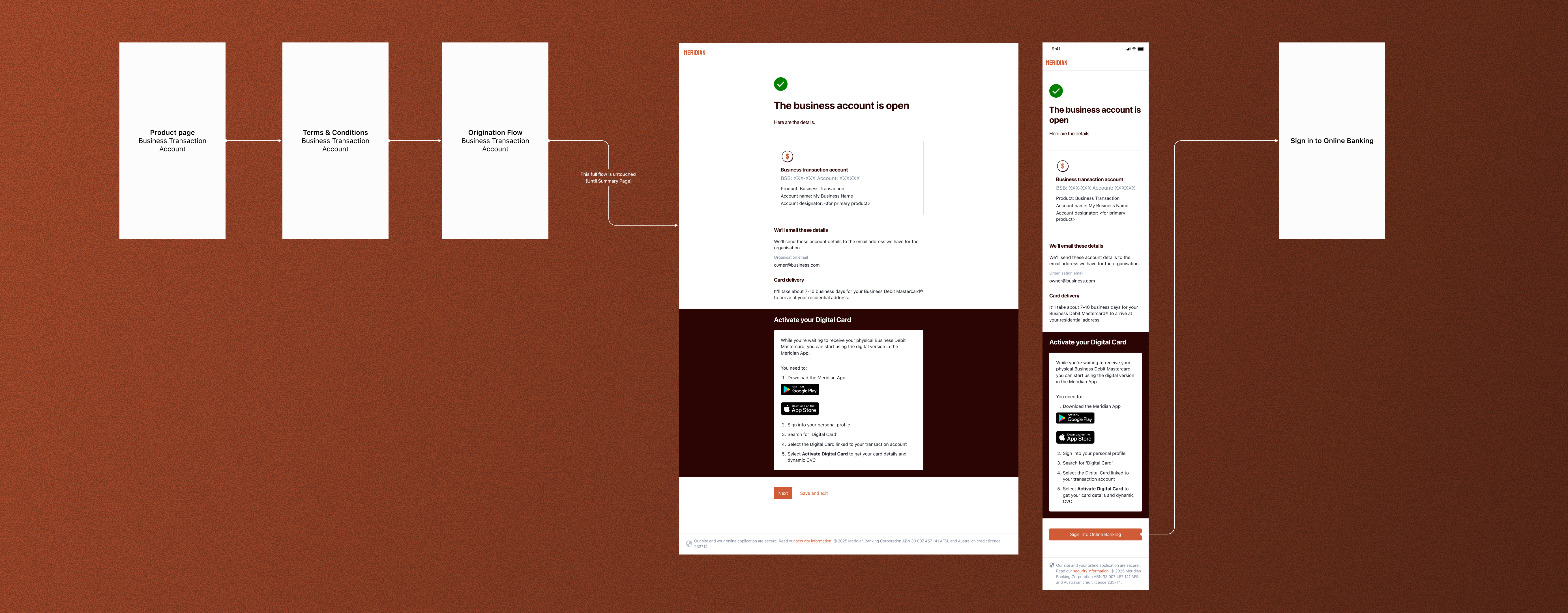
When a small business customer finishes opening a bank account, there is a window of time before their physical card arrives. The Instant Digital Card fills that gap: a digital card available immediately, ready to use before anything arrives in the mail.
My job was to design the component that introduced this feature. Simple enough in concept, but the challenge was that the same component had to work across two very different flows with opposite desired behaviors: one where we wanted customers to activate their digital card right away, and one where activating mid-flow would actually be a problem.
I owned the end-to-end: design, research planning, recruiting, running sessions, synthesis, and writing both research reports.
The challenge
Two contexts, opposite goals
The IDC component appeared in two flows with completely different jobs to do.
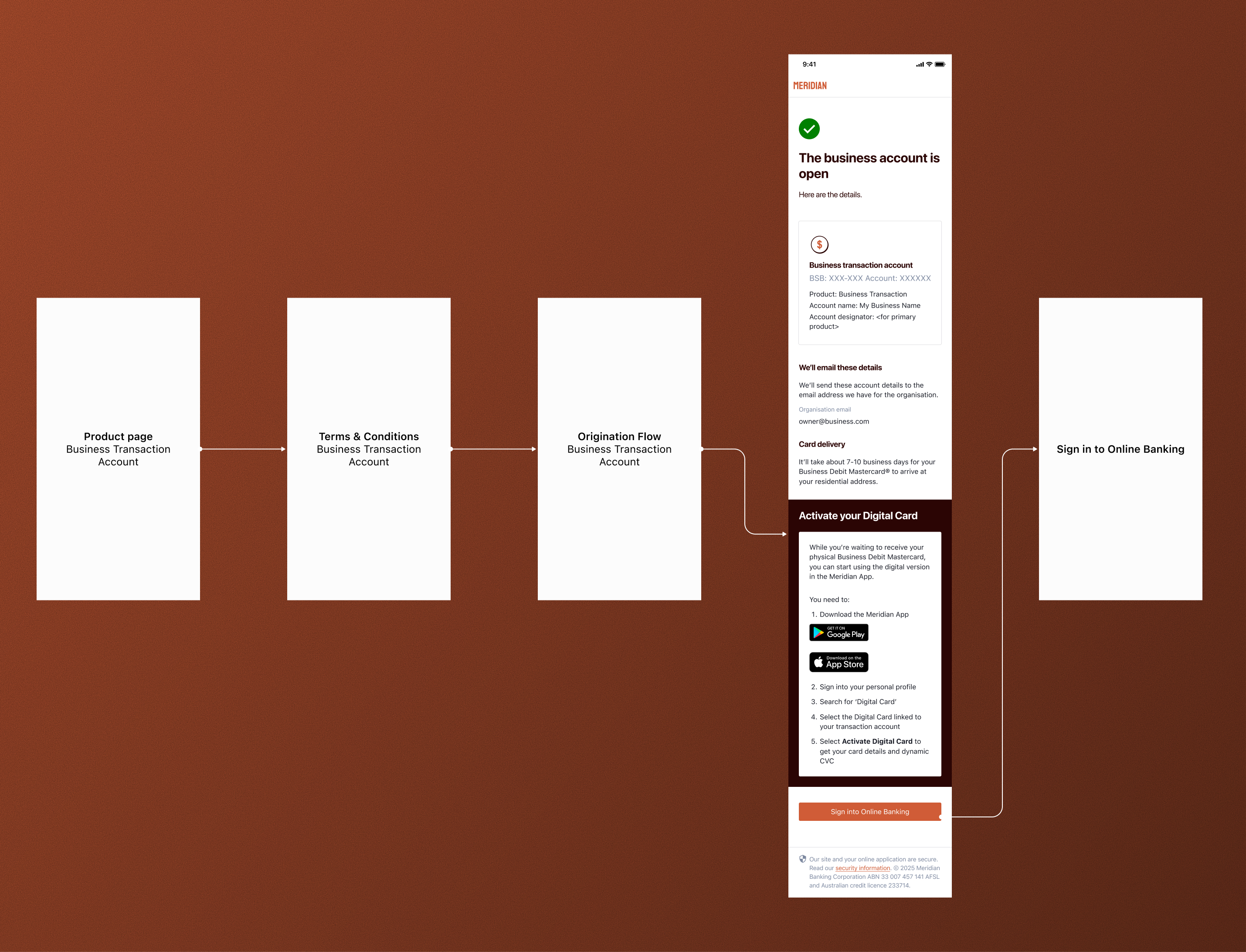
Accounts-only origination
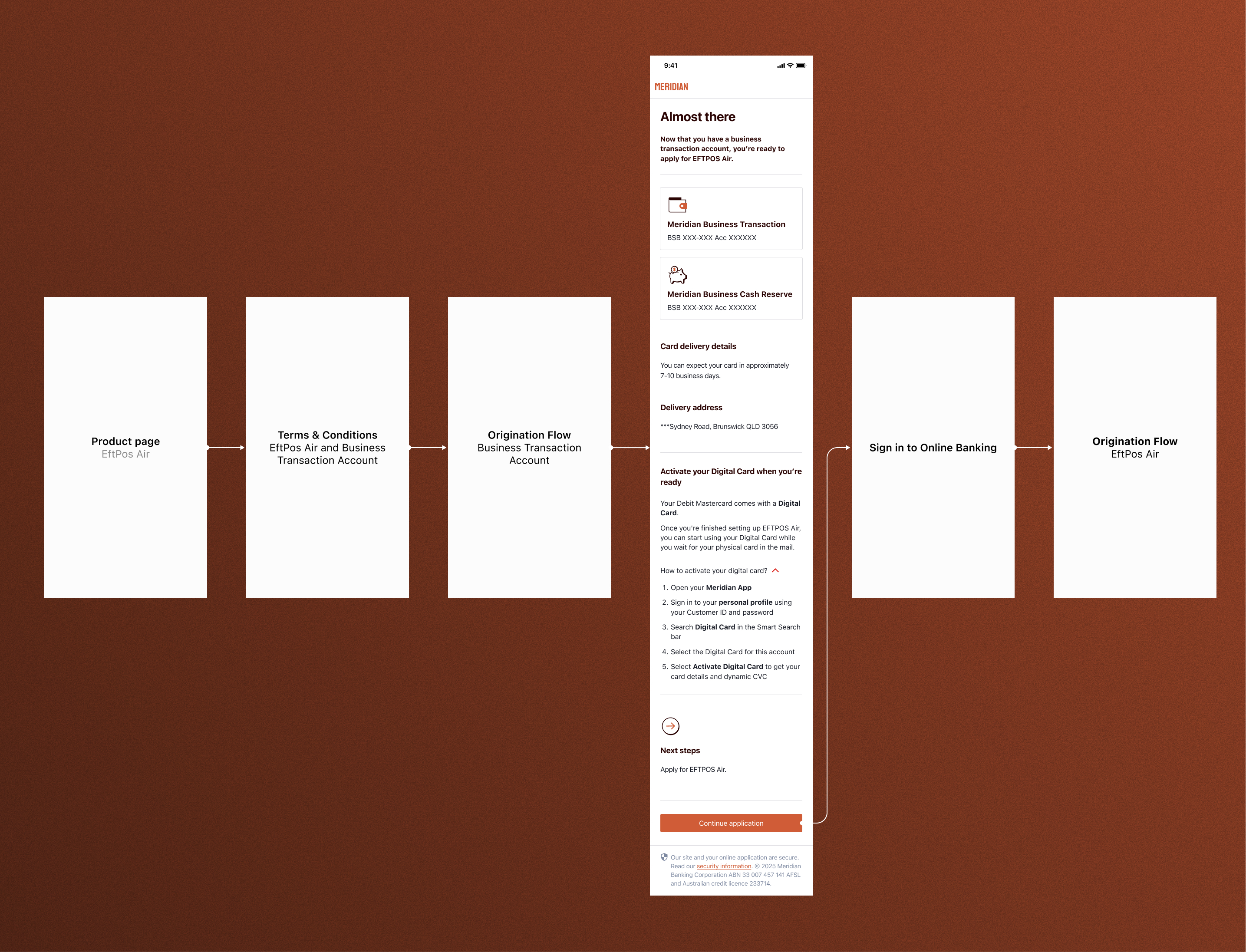
EFTPOS Air / Online Pay application
The core design tension: valuable and worth acting on in one context, purely informational without being a dead end in the other. Same component, two very different jobs.
The work
What I did
Design
The key decisions were around how to signal optionality. The accounts flow variant needed a clear, motivated call to action. The bridge screen variant had to make it obvious that activation could wait without feeling like a dead end.
This meant the component could not rely on copy alone. Visual hierarchy and interaction weight had to communicate the right behavior depending on placement. I worked with a content designer on the copy and messaging for both variants.
Research
I ran two separate rounds of usability testing across the two flows, with a mix of ETB (existing-to-bank) and NTB (new-to-bank) sole traders and sole directors aged 18 to 65.
I wrote the discussion guides, recruited and screened participants, ran both moderated and unmoderated sessions depending on the flow, synthesized findings, and wrote both research reports.
Outcomes
All hypotheses were validated across both flows. The accounts flow (12 participants) returned a SUS score of 94. The EFTPOS Air flow (4 participants) returned 89.4; both well above the acceptable threshold.
The feature had complete stakeholder sign-off and was ready for development handover when I transitioned out of the company.
Results
It worked in both places
The component achieved what it needed to in both contexts: it drove intent to activate in the accounts flow, and stayed out of the way in the EFTPOS flow without disappearing entirely.
Accounts-only flow
- 8 of 12 noticed the IDC section without being prompted
- 11 of 12 said they were very likely to activate immediately
- 10 of 12 expressed interest in using the digital card for their business
EFTPOS Air flow
- 4 of 4 continued with the EFTPOS application without feeling disrupted
- 4 of 4 understood that IDC activation was optional
- 4 of 4 successfully navigated to IDC activation when asked to do so later
“The design problem was not really about the component itself. It was about context.”
Looking back
Reflection
The most interesting part of this project was that the design problem was not really about the component itself. It was about context. The same visual element communicates completely differently depending on where it sits in a flow and what the user is trying to accomplish at that moment.
Getting that right required thinking beyond the component in isolation and considering the full journey state of the user at each touchpoint. That, combined with validating both behaviors through research rather than assumption, is what gave the team confidence to move forward.
Owning the full research process end to end on this one, from writing the discussion guides to delivering the final reports, also reinforced how much design quality depends on asking the right questions before and during testing, not just after.